A React application that enables non-technical team members to create SVG coverage maps. Its intuitive interface and iterative improvements made it a valuable time-saving tool for various team members, while enhancing accessibility for all users.
Coverage maps are utilized throughout the UPMC Health Plan public site to convey information about the available insurance plans and coverage options across the state of Pennsylvania.
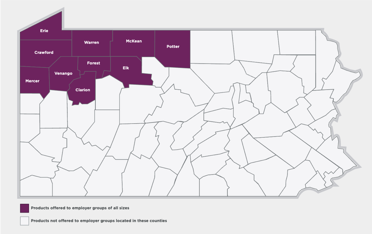
An example of a coverage map
When I joined UPMC Health Plan in 2019, these maps were originally created as JPGs, intended for print marketing materials.
However, using JPGs on the website raised concerns regarding accessibility. If the information in the image was not also presented as text content, these maps would only cater to sighted users, leaving some users unable to comprehend the information, especially if they were utilizing a screen reader.
To address this issue, I took the initiative to create SVG versions of the maps with a code structure that emulates lists, thereby enabling screen reader users to perceive the content just as effectively as sighted users.
The SVG structure consists of a parent list containing sub-lists for each grouping of counties. Each sub-list is equipped with a title element that describes its content, such as 'Product not available in these counties.' The counties within each sub-list are listed alphabetically, with each county name represented in a title element.
Below is an abbreviated example of the SVG structure.
<garia-label="Counties in Pennsylvania"role="list"><garia-label="Product available in these counties"role="list"class="map-0"><title>Product available in these counties</title><grole="listitem"><title>Allegheny</title><polygonclass="county"points="..."></polygon><text>Allegheny</text></g><grole="listitem"><title>Washington</title><polygonclass="county"points="..."></polygon><text>Washington</text></g></g><garia-label="Product unavailable in these counties"role="list"class="map-not-included"><title>Product unavailable in these counties</title><grole="listitem"><title>Adams</title><polygonclass="county"points="..."></polygon><text>Adams</text></g><grole="listitem"><title>Armstrong</title><polygonclass="county"points="..."></polygon><text>Armstrong</text></g></g></g>
SVG was an improvement, but tedious
While the SVGs provided a significant improvement, the process of creating them was undeniably tedious. It involved copying and pasting the code for each of the 67 counties into the appropriate list elements, all while ensuring they were arranged alphabetically. This endeavor could consume an entire workday or more to generate just one map asset.
In 2021, presented with a series of maps to create and having some extra free time, I decided to dedicate a workday to explore the possibility of designing a user interface to automate the generation of map SVGs.
The goal was to determine if implementing this UI would streamline and expedite the map creation process. Additionally, I aimed to assess whether the interface was user-friendly enough for content managers to utilize on their own, effectively eliminating the need for me to handle this arduous task.
Creating an MVP
The map generator Minimum Viable Product (MVP) encompassed several key features:
Users were able to select whether each county was marked as 'included' or 'not included' in their plan.
Both the included and non-included county groups had customizable titles.
The map itself had a custom title.
The map graphic was dynamically generated using SVG based on the user-provided data, with the capability to be previewed and downloaded.
For this initial version, I opted for create-react-app, given its suitability for a simple one-page application. As the project didn't require server-side rendering or routing, there was no need to use Next.js, Gatsby, or any other complex framework.
In this first iteration, users could indicate whether a county needed to be included through a single checklist. They could also enter the titles using standard input fields. The form data from these inputs was stored in the application's state and then mapped over to generate the counties within the SVG, organizing them correctly into the included or non-included groups. The two groups were represented as lists to accommodate non-sighted users, and CSS styles were applied for visual formatting. The group titles were utilized as list titles and also to create a visual key below the map.
While users input the data required for their map, a live preview of the SVG updated in real-time. Since the form data was stored in the application's state, a new SVG was re-rendered with each state change. To enhance the user experience, I incorporated the npm package 'react-code-blocks' to display a preview of the SVG code, allowing users to double-check the code output alongside the visual representation.
Once users were content with their map creation, they could conveniently download the SVG file. This was achieved by using the Blob constructor of the File API, enabling the browser to create the SVG file for download.
Success and future improvements
On that first day, I managed to implement most of the app's functionality, which convinced me that investing an additional day or two to finalize the project, address minor bugs, and add some visual polish would be well worth it.
The tool proved to be immensely valuable for our team at UPMC Health Plan, serving as a significant time-saver while simultaneously enhancing the accessibility of our content. Now, individuals ranging from designers and developers to content and product managers can effortlessly create the maps they require to effectively communicate diverse product coverage.
While the MVP, featuring two map groups, catered to the majority of use cases, there were still a few maps that demanded more than two groups or categories, necessitating manual creation. I proceeded to iterate on the original utility, enhancing it to allow the selection of up to five different categories within a single map. This undertaking involved refactoring how the state was stored and manipulated to create the groups, along with developing the frontend UI to enable the creation and removal of groups, instead of one big list.
For the next planned iteration, I intend to expand the options for fill colors and patterns, ensuring enhanced contrast between the groups. This improvement will make the tool even more accessible for low-vision and color-blind users.