UPMC Health Plan's marketing emails were facing significant challenges, lacking modern features essential for effective communication, such as mobile responsiveness, preheader text, and accessibility considerations. The absence of a streamlined process and toolset for email mockup and development made things harder than they needed to be. Collaborating closely with an Email Strategist, and the design team, I started a comprehensive analysis to identify goals achievable with a design overhaul. The culmination of this effort was the inception of a Design System, which would revolutionize our approach to email marketing.
Built With
Figma
Foundation for Emails
SASS
Gulp
Design foundations and components
To gain a comprehensive understanding of the existing landscape, I looked at existing email campaigns and audited what was needed in a design refresh. I discovered a lot of visual inconsistency across common elements like buttons, text styles, and headers. Accessibility of the content is incredibly important, especially when communicating important information about a member's healthcare. I found a large use of text embedded in images, which is inaccessible to those using a screen reader, or have images blocked in their email client.
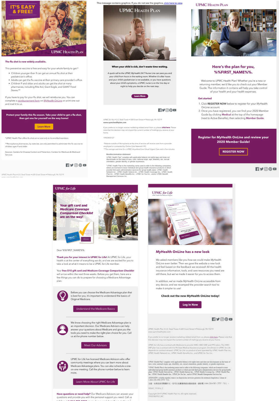
Examples of existing email campaigns with inconsistent header, button, and text styles.
In order to have a solid foundation with consistent branding and styles, yet highly customizable for each campaign, a more systemic approach was needed. I started to conceptualize and create foundational styles and a library of content components that could be mixed and matched together. This would allow designers to focus on the email content and goals, instead of adapting content to pre-defined templates.
Foundational styles
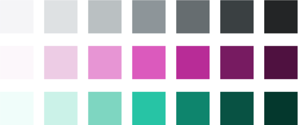
UPMC Health Plan has an existing brand that has strong foundations for elements like typography, color, and style. I was able to utilize an existing color palette that has been tested and optimized for color contrast to meet accessibility requirements.
Color palette
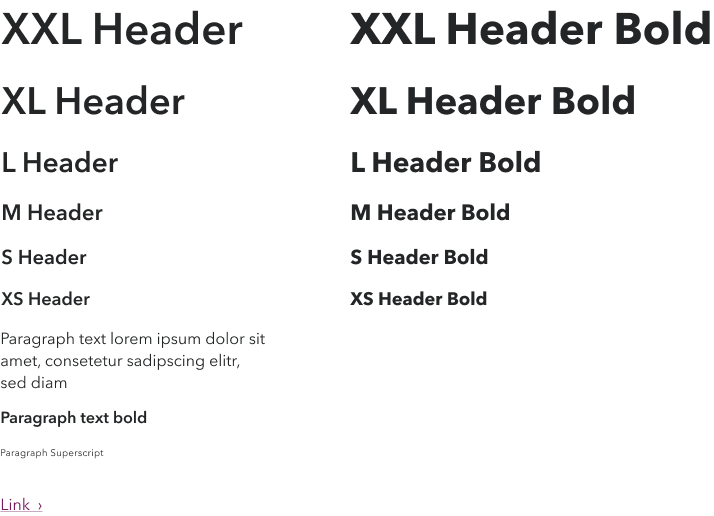
I defined a handful of heading styles and sizes using a modified 1.125 type scale, as well as styles for body copy.
Text and heading styles
A 12 column grid and 580px width was established, these values derived from the development framework that would be used, Foundation for Emails.
Component design
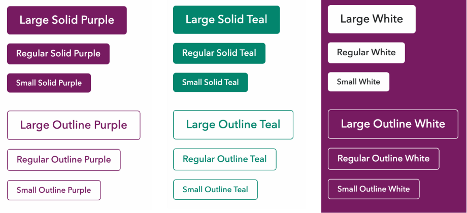
Once the foundations were established, I moved on to the design of the base components consisting of buttons, headers, callouts, photo and icon text content pairs, brand bars, and footers. These standardized components would ensure brand consistency across campaigns.
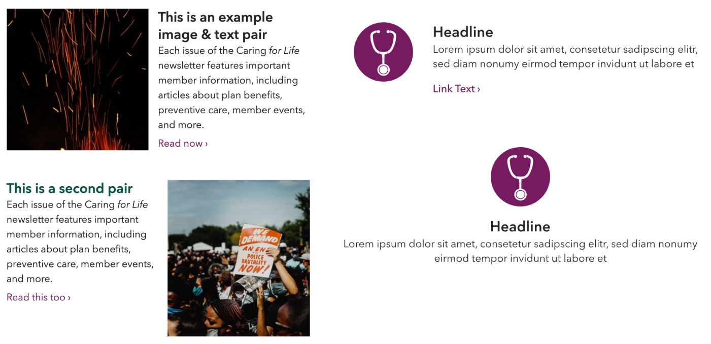
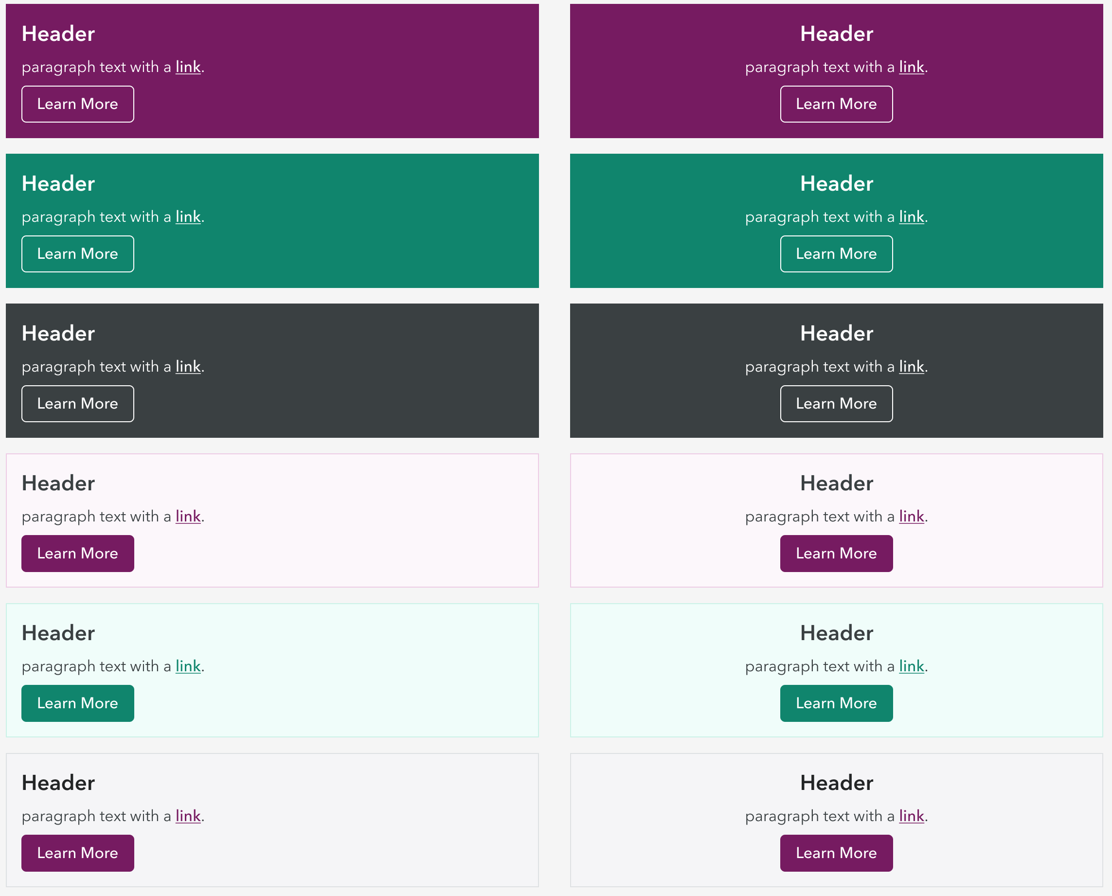
Button styles in three sizes, three colors, and two styles, solid and outline.Header styles with areas for images, text, and CTAs.Image and Text and Icon and Text pairs for presenting content with supporting imagery or icons from an existing icon library.Callouts used for adding emphasis to information or a CTA. Available in three colors and two styles.
To establish these base components, I analyzed previous campaigns and the design elements that were used, even if inconsistently. After compiling this list of components to be made, I received feedback from the team of designers and strategists that this would be enough to get us off the ground creating emails, and could identify other needs after creating this MVP.
Development tooling
The tools and process used to develop emails had a big opportunity for improvement. Designers were directly editing production HTML and table elements, usually relying on a previous campaign’s code as a starting point for the next campaign. Each designer had slightly different code which made it hard to support each other and create consistent communications across the organization. A lot of time was spent testing and troubleshooting every email because results were so inconsistent.
After researching different tools available, I decided to use the framework Foundation for Emails to create the actual email HTML. It gave us a lot of the modernization we were looking for out of the box like grid based responsive layouts, tested on all major desktop and mobile email clients, preheader text, shared styles, components and templating features.
Foundation allowed us the flexibility we needed to create custom styles for our brand. It was important that we could create mockups in Figma that would look identical to what we could produce in code. Using Foundation's partials and templating system gave us the freedom to mix and match components as needed instead of relying on strict templates.
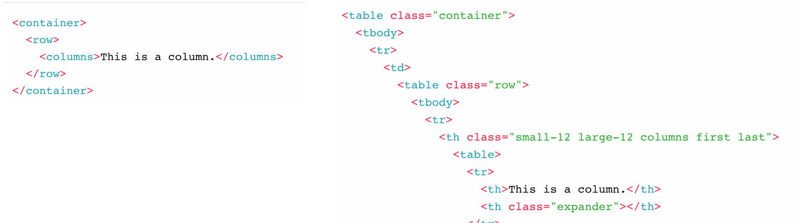
It also meant that the team didn't have to learn React or another new coding language, but provided a huge upgrade in developer experience. Foundation uses a custom element syntax that abstracts away and simplifies the complex table syntax required for emails. In addition, it comes with automatic HTML compiling, CSS inlining, image compression, and the ability to preview while working with a local dev server. These tools were seen by the team as a huge improvement and time saver compared to struggling with Dreamweaver and the complex table syntax required to produce the results we wanted!
Left: Foundation for Email's simplified syntax. Right: The complex table markup that the simplified syntax is eventually compiled to. The simplified syntax made it much easier and faster to code emails.
To build our code base, I forked the standard Foundation for Emails starter project and made customizations for our brand in order to create a codebase that the whole team could use:
Modified and added our foundational styles in SCSS.
Built complex components like headers, footers, content pairs, and brand bars as partials that can be customized or added as-is to any email.
Added scripts in gulp to customize the build process including:
Italicizing common product names
Adding standardized link tracking to links
Adding role=”presentation” to all table elements for better accessibility with screen readers.
Documentation
All components have documentation from a design and development perspective organized in a shared Notion. I also included basics on getting started with the component library and Foundation, as well as some of our internal processes and best practices.
Documentation held in Notion
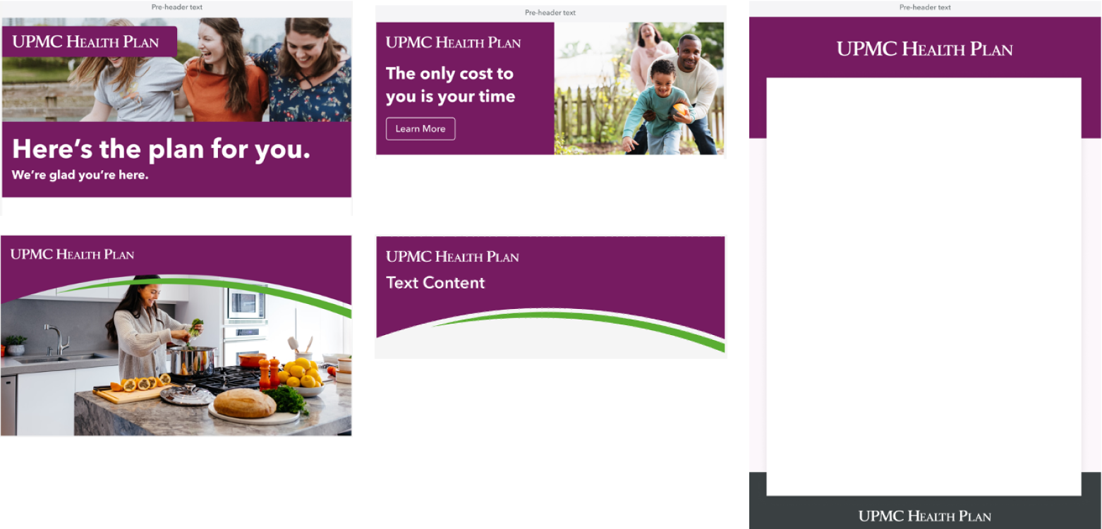
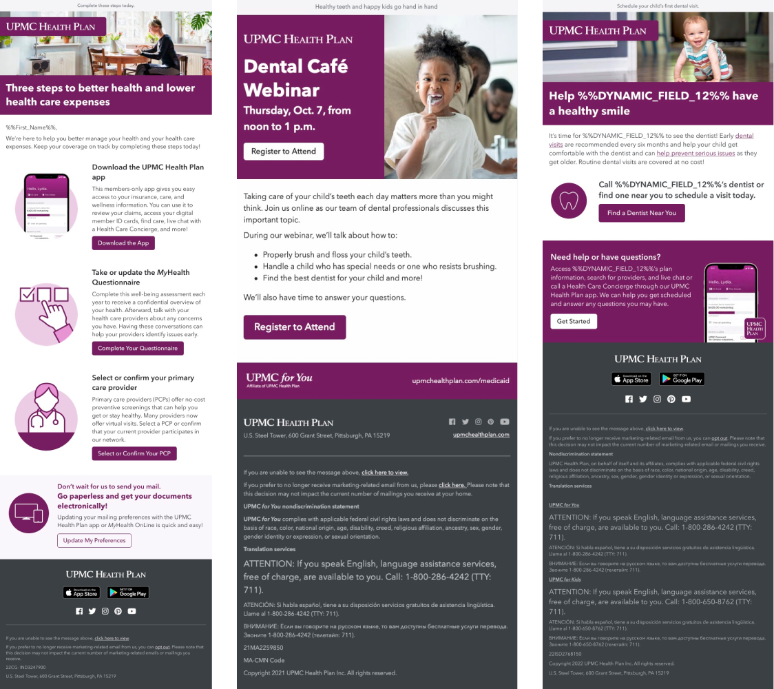
Examples of emails created using the design system
Three emails that were designed and developed with the design system, with consistent branding and styles, yet still highly customizable for each communication.
The Email Design System has been seen as a success throughout the organization. It resulted in increased productivity, accuracy, and more cohesive marketing email communications. With the time saved the team is able to focus more on A/B testing, optimization, and creating high-performing campaigns that increase our engagement and conversion rates.