How do you turn a clunky, map-based event finder into a sleek, user-friendly platform for Medicare members? This case study walks through our team's journey of research, design, and testing to revolutionize the way older adults discover and engage with healthcare events and meetings.
Built With
UX Research
UX Design
Figma
Introduction
The previous experience for Medicare members and prospects to find events and meetings near them was dated, unaccessible, and hard to use. As part of a larger transition into Sitecore CMS, I worked with a team consisting of a UX Researcher, Project Manager, and a client stakeholder to better understand the business needs and user expectations to inform a successful redesign.
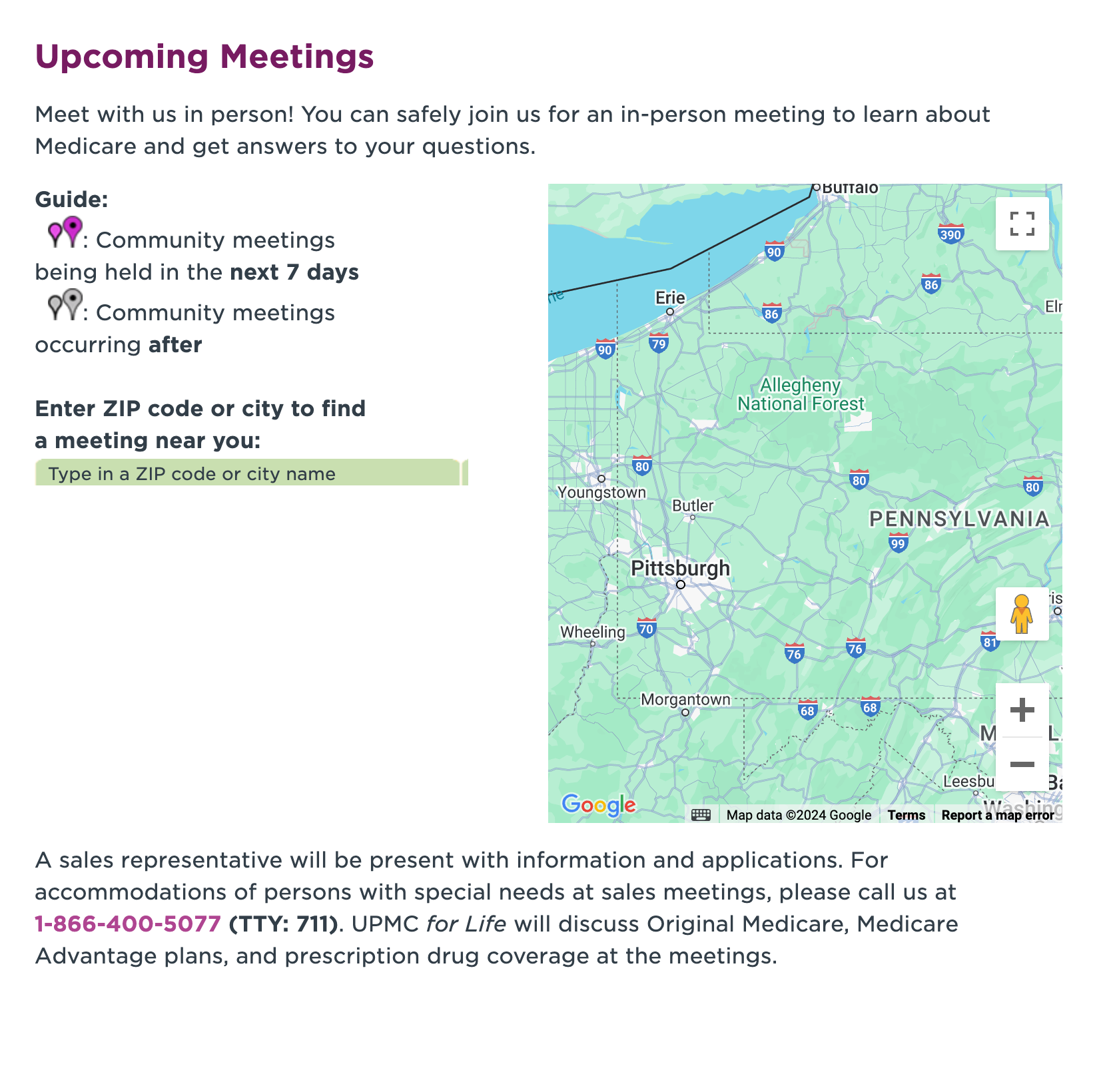
The previous event discovery experience that was map based. Events would appear as pin drops on the embedded Google Map.
Research and Discovery
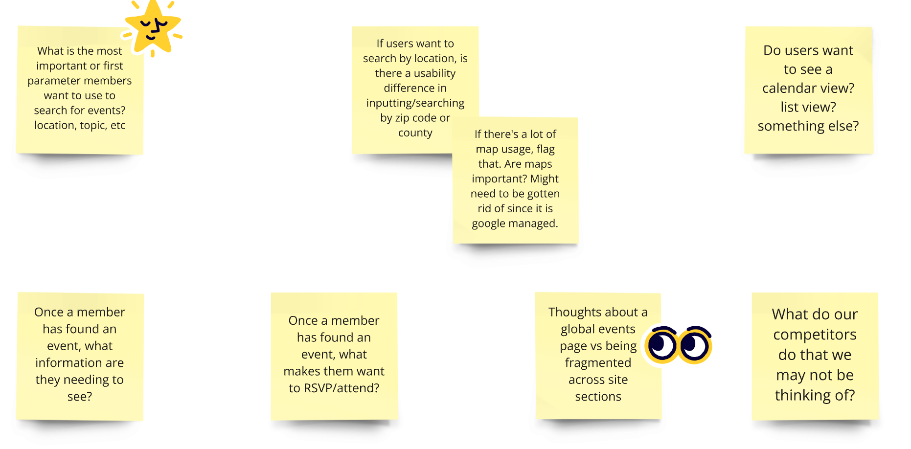
To inform the research, we compiled a list of important questions.
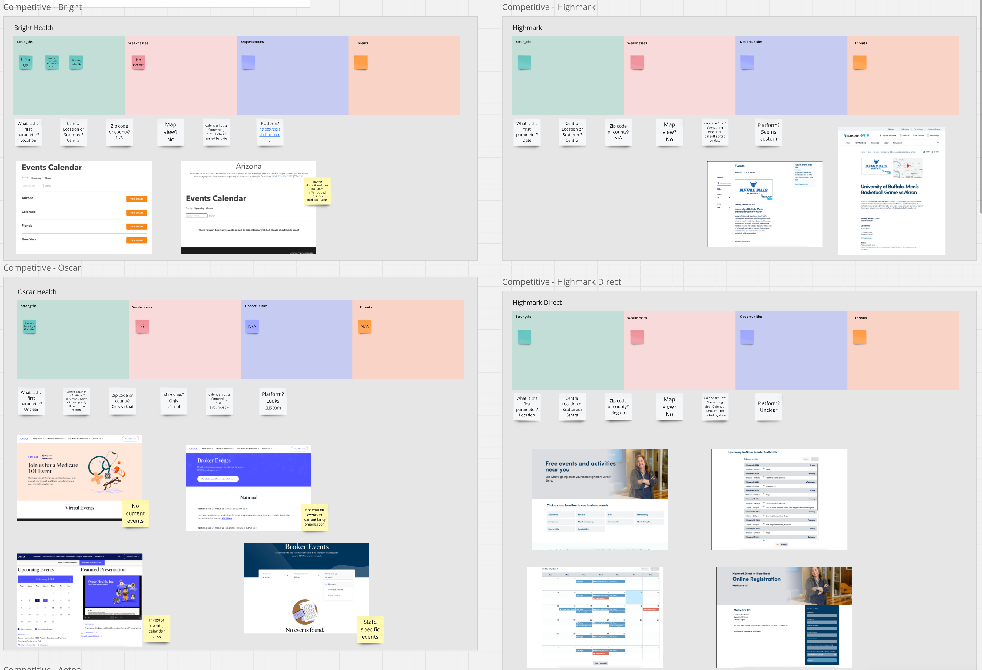
In order to start to answer these questions, the UX Researcher on the team conducted a competitive analysis and synthesized those results for the Product Manager and I to review. They looked at direct competitors like other health insurance companies, and non-direct competitors that host public events like Facebook and Eventbrite. The main dimensions we looked at stemmed from our initial questions, and were:
The first parameter used to find events (type, location, etc.).
If the user enters their location, is it their ZIP code, city, address, or other?
Do they include the events in a map view?
Do they display the events in a list or calendar format?
Are they using a third party platform or something custom?
A screenshot of a portion of the synthesized competitive analysis in Miro.
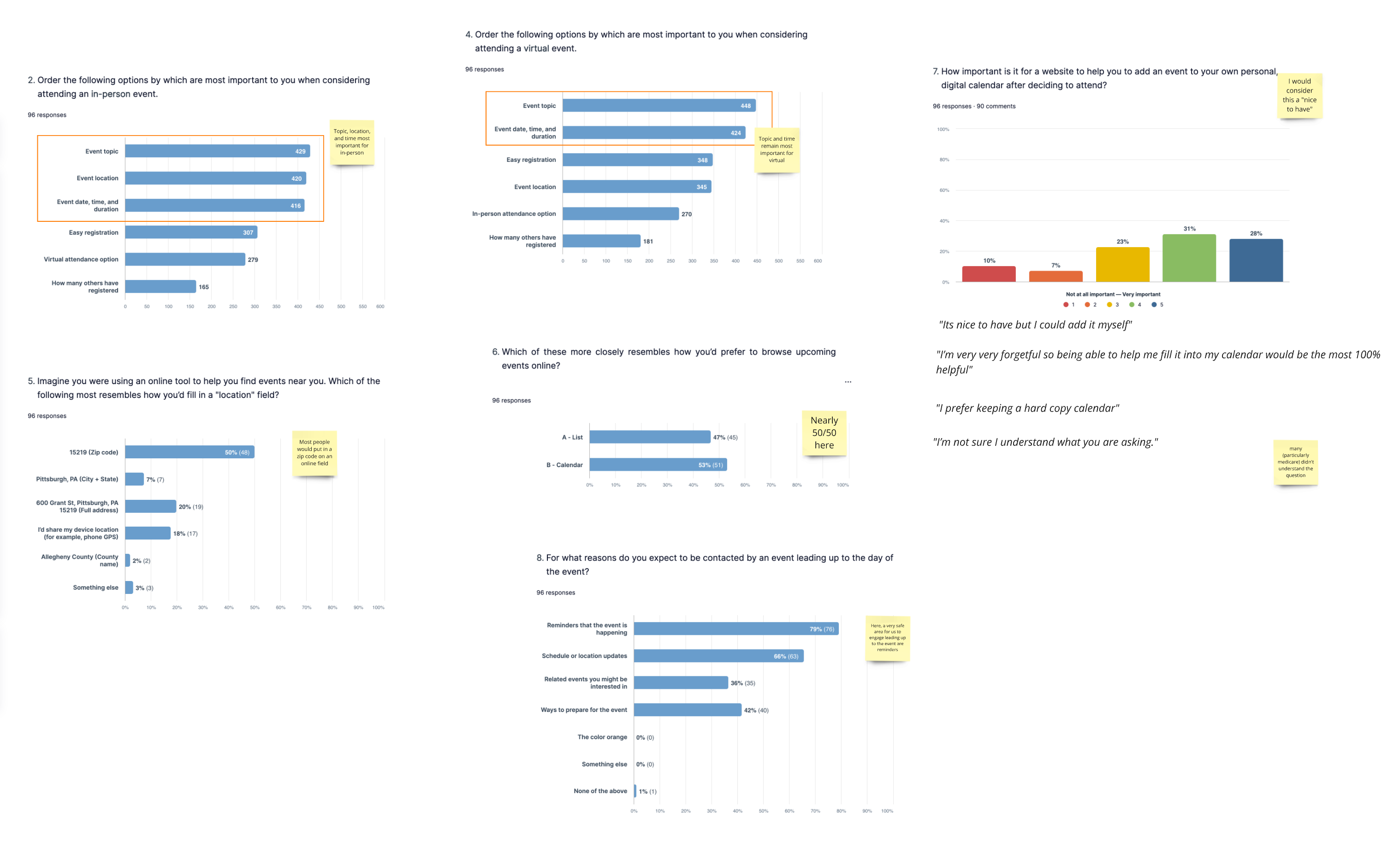
We also conducted a survey of 100 people who have insurance and would consider attending health insurance related events to better understand our potential user's preferences when interacting with event discovery experiences. 50% of these participants were Medicare age (65+).
A screenshot of the results of the preferences survey.
From these two research methods we learned a lot about what our users would be expecting, including:
To search for events by topic and location.
To indicate their location by ZIP code.
Most direct competitors did not offer a map view, but some larger non-direct competitors did.
There was no clear winner between showing events in a list or calendar view.
Design Exploration
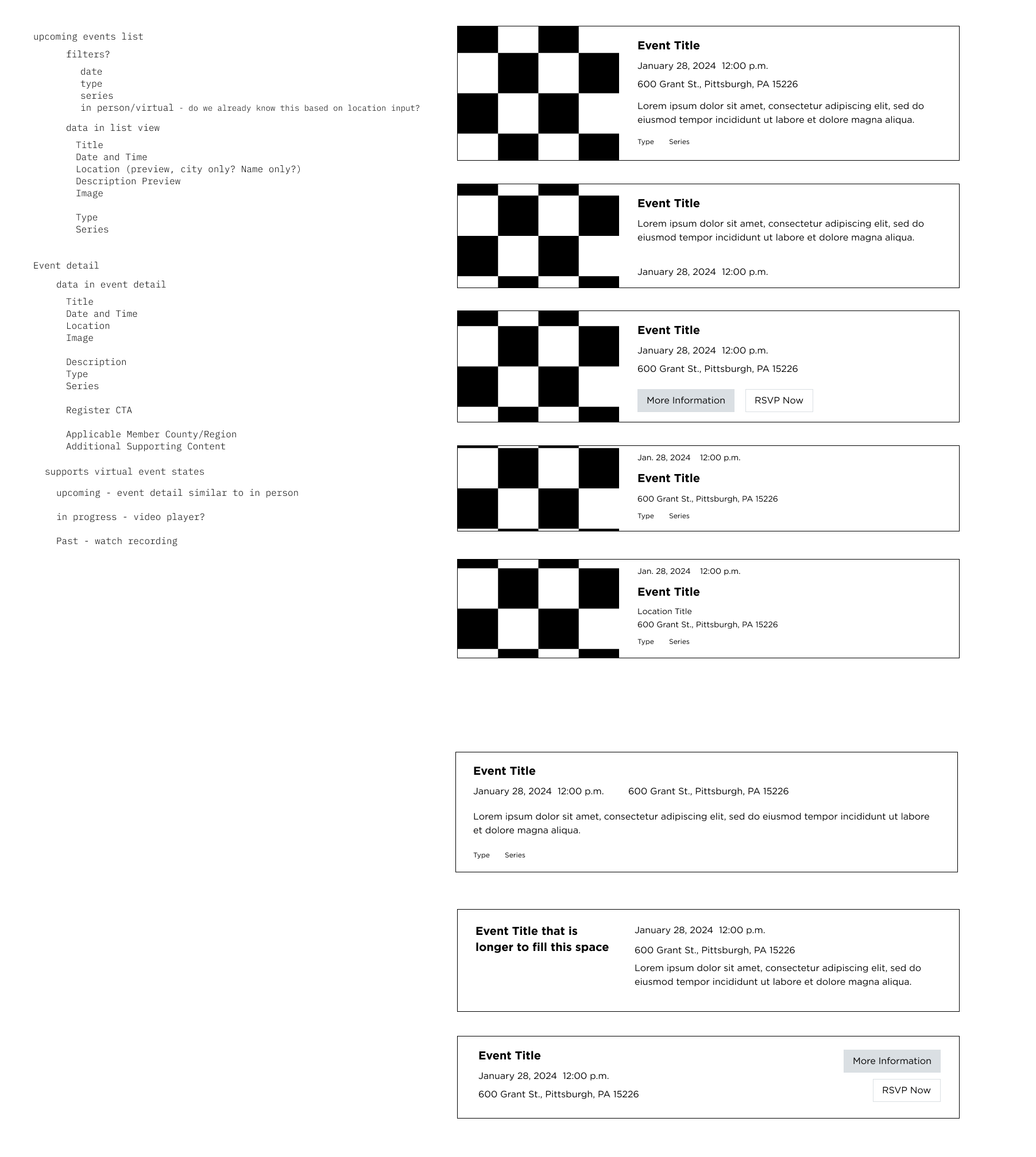
With these findings to guide me, I started to iterate on wireframes to find potential design solutions, starting with an event listing component. I explored including an image, call to actions, a description, time, location, and other information that would be available for each event. I wanted to find a balance of information that would entice the user to click through to the event page, without being too overwhelming.
Wireframes of how an event could display in a list.
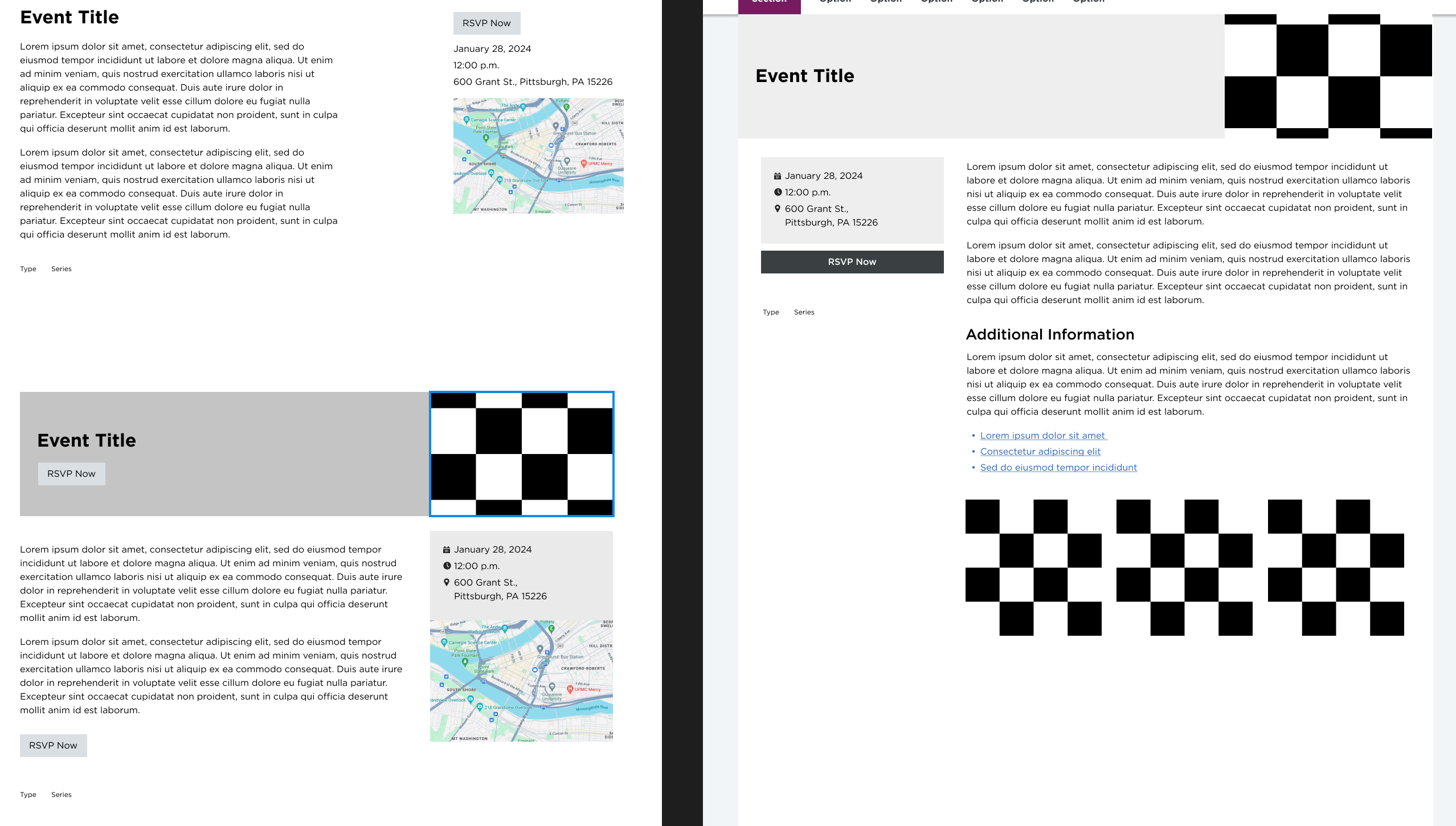
After exploring the listing component, I worked on wireframes for the actual event information page. This page needed to display all relevant information for the event, encouraging the user to register for the event.
Wireframes of the event information page.
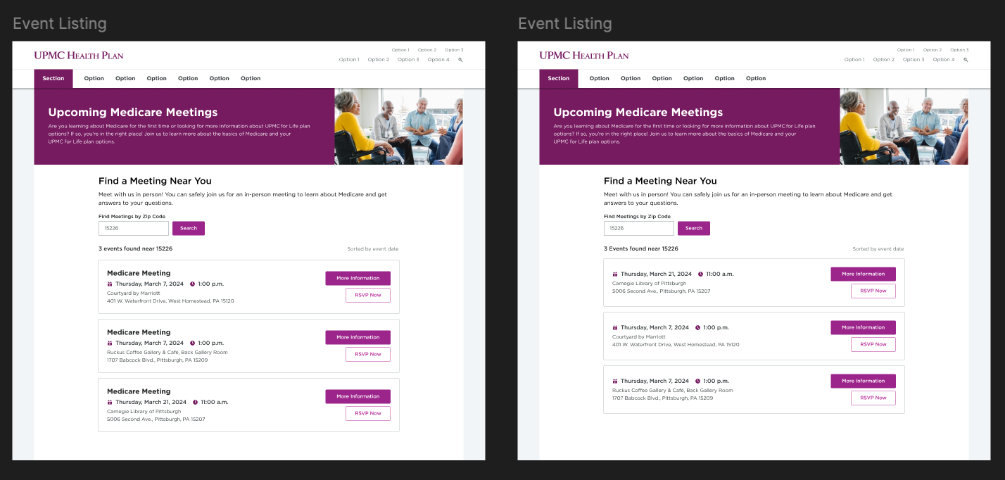
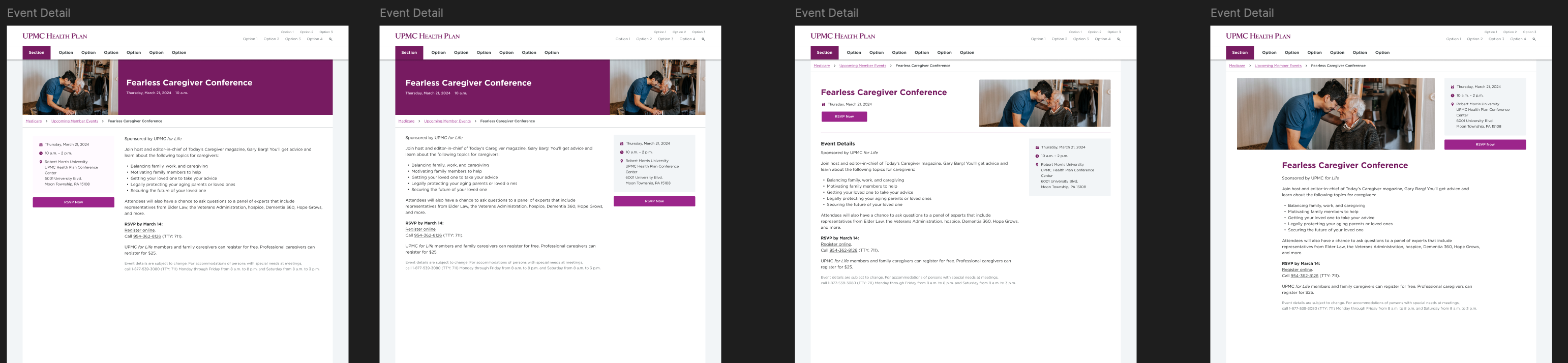
After discussing these wireframes with the team, I used their feedback and continued to iterate on the designs, adding more visual design to start to get a real sense of how the event experience could look and function. I used styles and components from our enterprise Design System to inform the visual design so that this experience would be consistent with other site sections and the brand overall.
Visual design exploration for event listing.Visual design exploration for event listing empty state, encouraging the user to provide their ZIP code to find events near them.Visual design exploration for event detail pages.
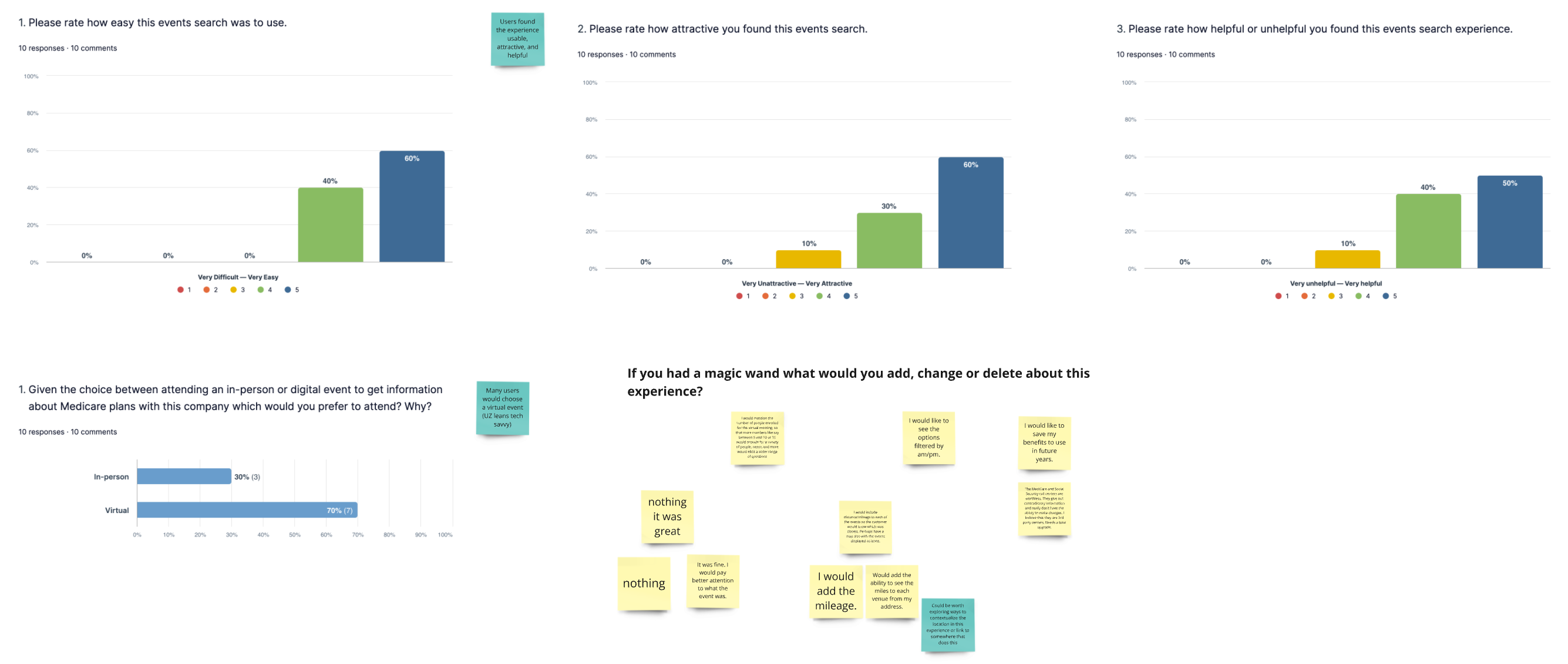
Once I found a solid direction with the visual design, I validated the designs with internal resources. Through this process we discovered that prospective meetings would require a unique experience from member meetings that didn't include an event detail page. We focused on these prospective meetings and built a prototype we could use to do usability testing with a group of 14 users, half general population and half Medicare age. With this usability test we wanted to gauge how easy users found the experience, and if they felt anything was missing.
Results from the usability test showing the experience was easy to use and helpful.
One of the biggest pieces of feedback we got from the usability test was to add the distance from the user's location to the event location as part of the event listing to make it easier to select the closest event.
Conclusion
After the design and development hand off was completed, this feature was placed into the backlog in order to prioritize higher impact features, but the team is looking forward to implementing all this work and continuing to iterate on its success.